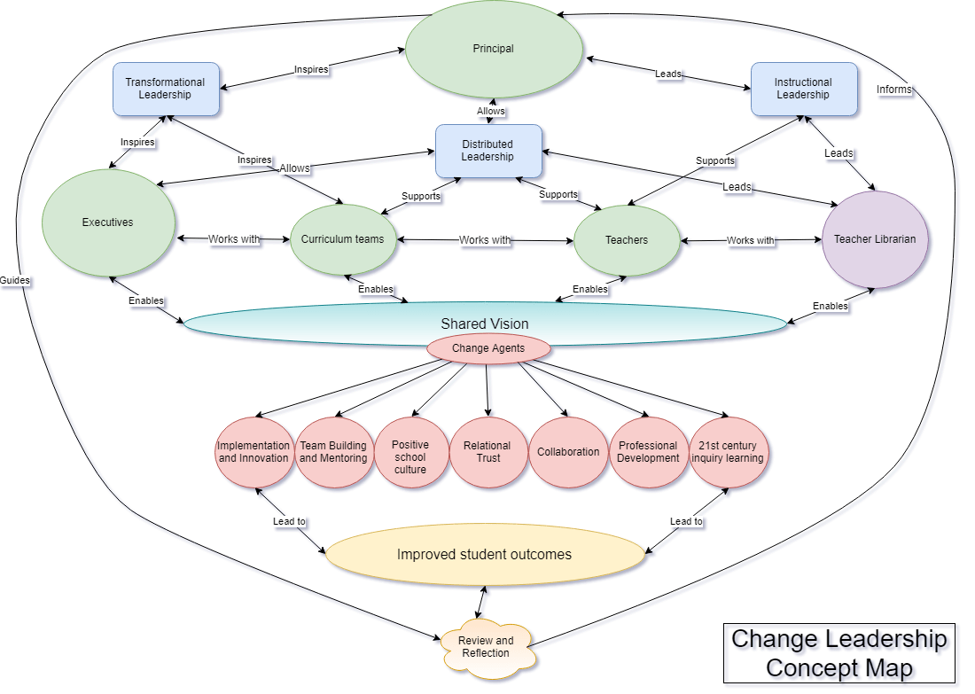
Well, here it is. I spent many hours adjusting, playing with the colours and arrows, moving, resizing, labelling and fiddling. Elements of the map I was happy with while other parts didn’t quite seem to fit. Keeping the map ‘neat’ was tricky and making it look like ‘a dog’s breakfast’ would have made it ‘unreadable’ and complicated. Assessment feedback listed many possible adjustments including adding a colour key, resizing and rethinking descriptions on the arrows. Overall, I found this a difficult exercise. Placing concepts together to build ideas and relationships is complicated.

I found this process quite difficult, too. I think and process better verbally than in this diagrammatic way, I believe.
Yours is much more open and pretty and much less cluttered than mine, LOL.
Were you satisfied with your mark on this portion – just asking because I am gathering from personal and reported experiences that a pre-ponderance of negative or “constructively criticising” comments on the map did not necessarily equate to a poor mark…
Onwards to Assessment 2!
Marika
I managed a D with the map! Yes, so many points of constructive criticism. I guess that’s why Jennie and Lori said no student has ever received full marks for this task…